Easysign is an application that makes it easy for business people, private employees, shop owners, freelancers, and other jobs that require signing documents online. With complete features that help users streamline their business and document affairs
Project Overview
Using EasySign can speed up your work in document matters and company business. It also supports various types of document formats and can be connected via a cloud system to several cloud storage applications.
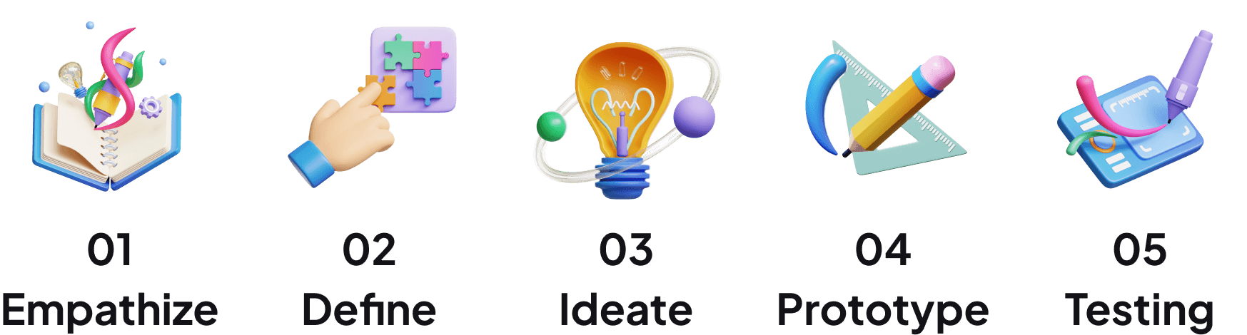
Design Thinking Process
Product Requirement Document
EasySign aims to provide a user-friendly and efficient digital signature software that simplifies signing and managing documents electronically. The software will offer extensive file type support, PDF form conversion, standard and custom tags and fields, cloud storage integration, PowerForms, comments, and drawing capabilities.
Target User
The target users for EasySign are individuals, professionals, and businesses of all sizes who require a streamlined and secure solution for digital document signing and management.
User Story
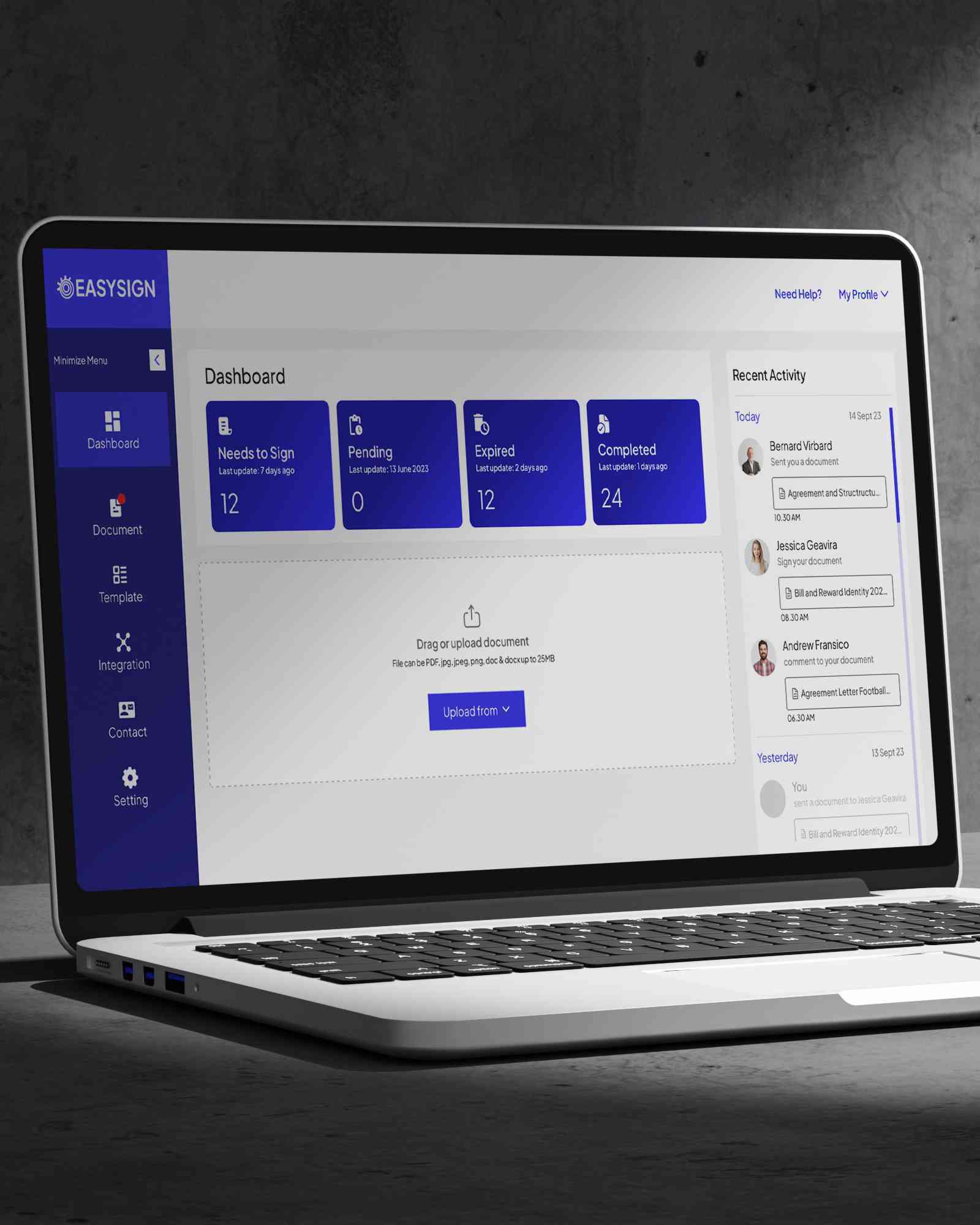
Users can view the dashboard page to monitor the status of documents and see activities related to the account.
Users can easily send a document and enter the recipient information on the paper. Then users can also quickly enter custom fields in the form provided in the document.
It supports many types of document formats that users frequently use. Apart from that, users can also upload from the cloud storage system.
Convert various types of documents to interactive digital forms that can be filled in with custom fields and tags that the sender or recipient themselves can determine.
Create powerful templates that can speed up document delivery and be differentiated based on the recipient and their needs.
Users can discuss with each other by providing or viewing comments from other users. This feature is also used for review before signing.
Users can use the feature to set signature types and edit their signatures.
As a document sender, you can enter multiple recipients more quickly and include recipient contacts in groups.
Users can customize the branding of the application display by entering a logo, tagline, and company colors.
Comparative Research
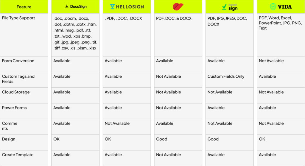
To make this product, I first tried to do comparative research with several brands that were already available and had been used. This comparison was also done by looking at the general features that could be combined into the final product.
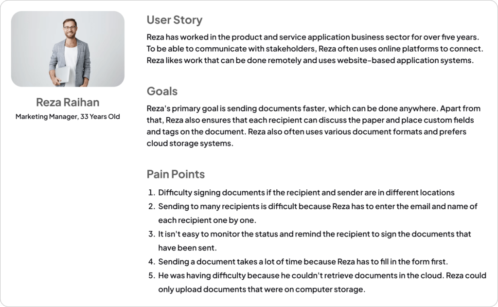
User Persona
User Flow
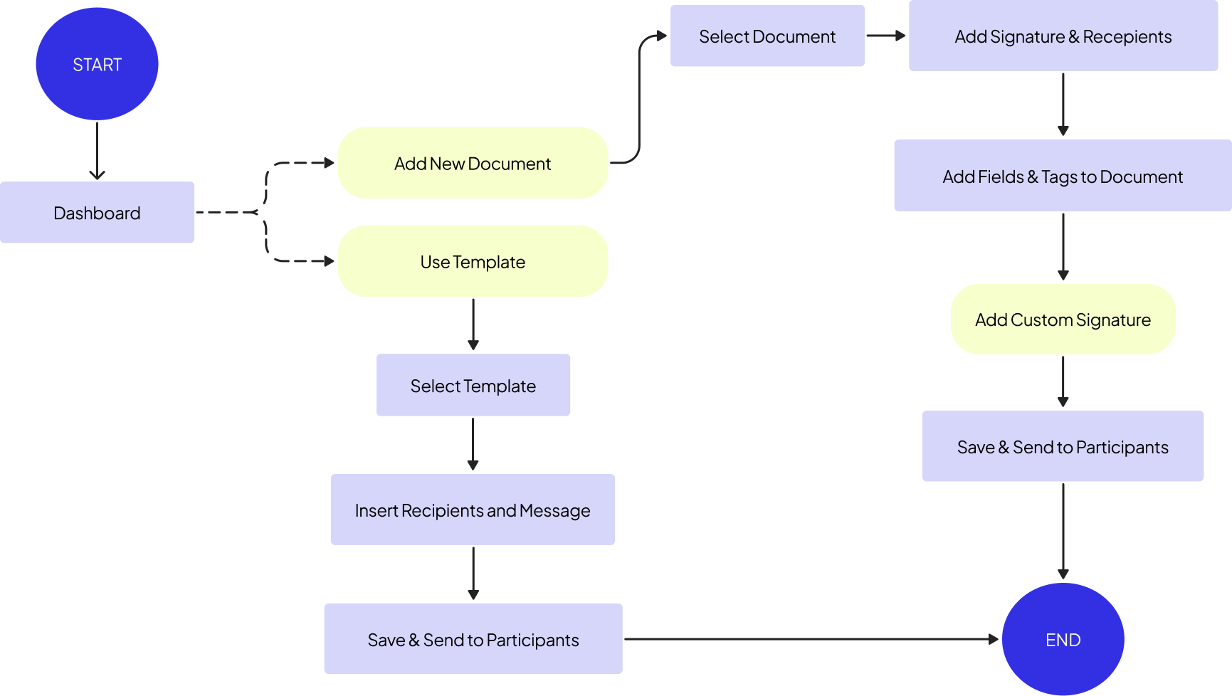
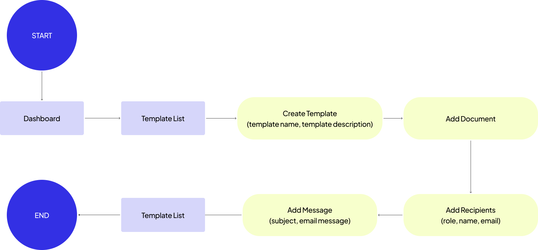
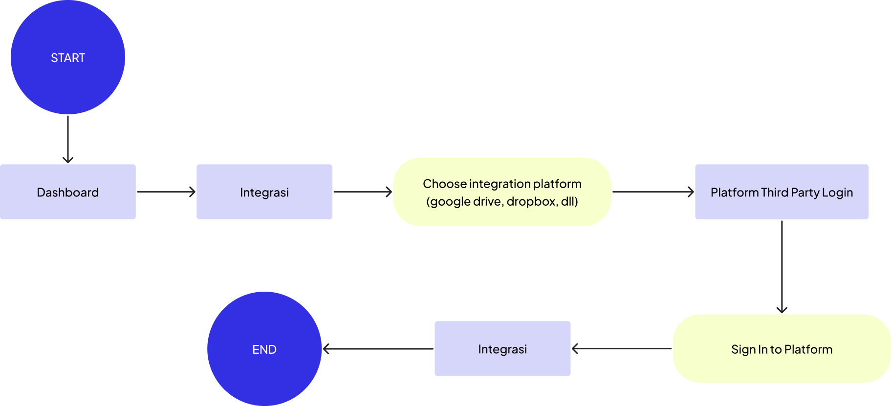
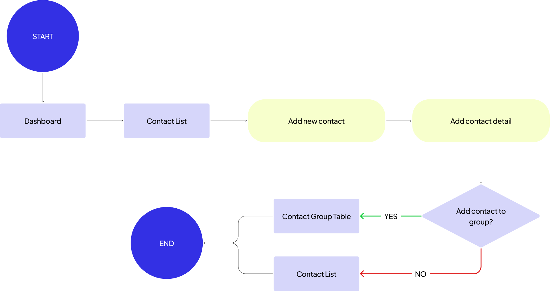
To make design planning more accessible, I start by mapping out the user flow. This helps me understand how users use a feature and create a more transparent, organized, high-fidelity prototype.
Send Document
Create Template
Account Integration
Add Contacts & Group
Information Architecture
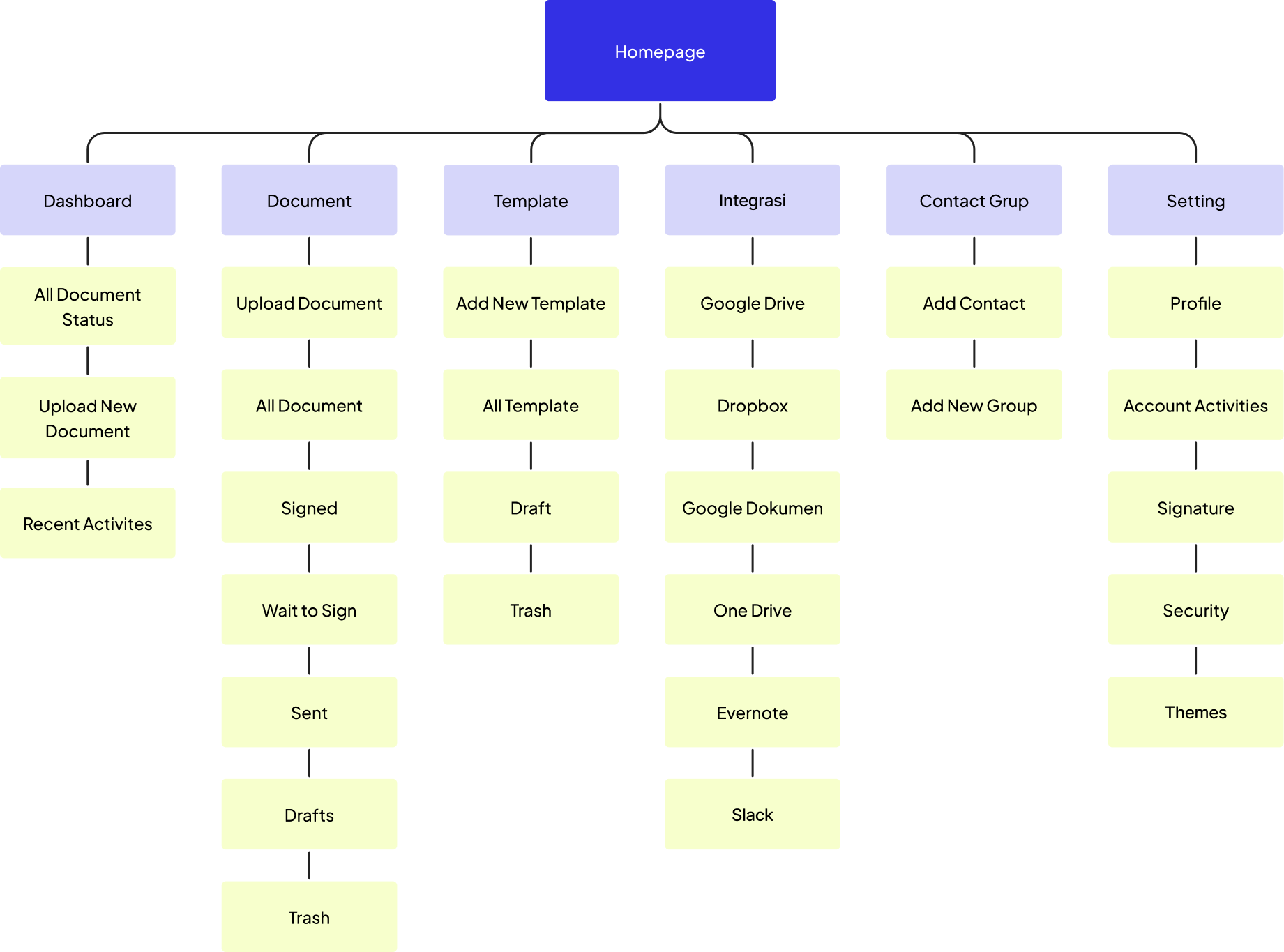
The use of information architecture can be a guide in creating page designs; this section can also explain the structure and content of the page.
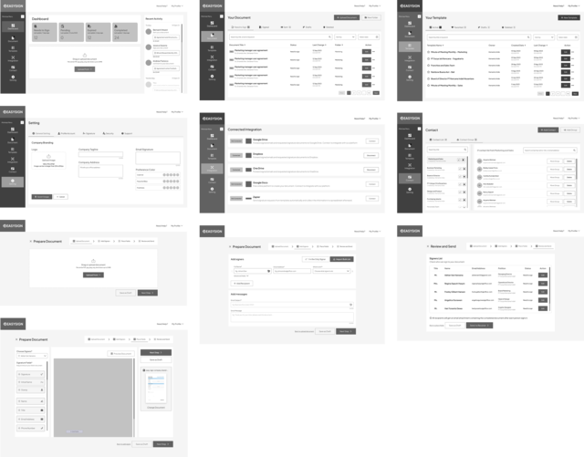
Wireframe
Design Style
Typography
I selected the 'Plus Jakarta Sans' font for its modern, clean appearance. For Heading 1 through Caption, I used Regular, Medium, Semibold, and Bold font weights.
Color Palette
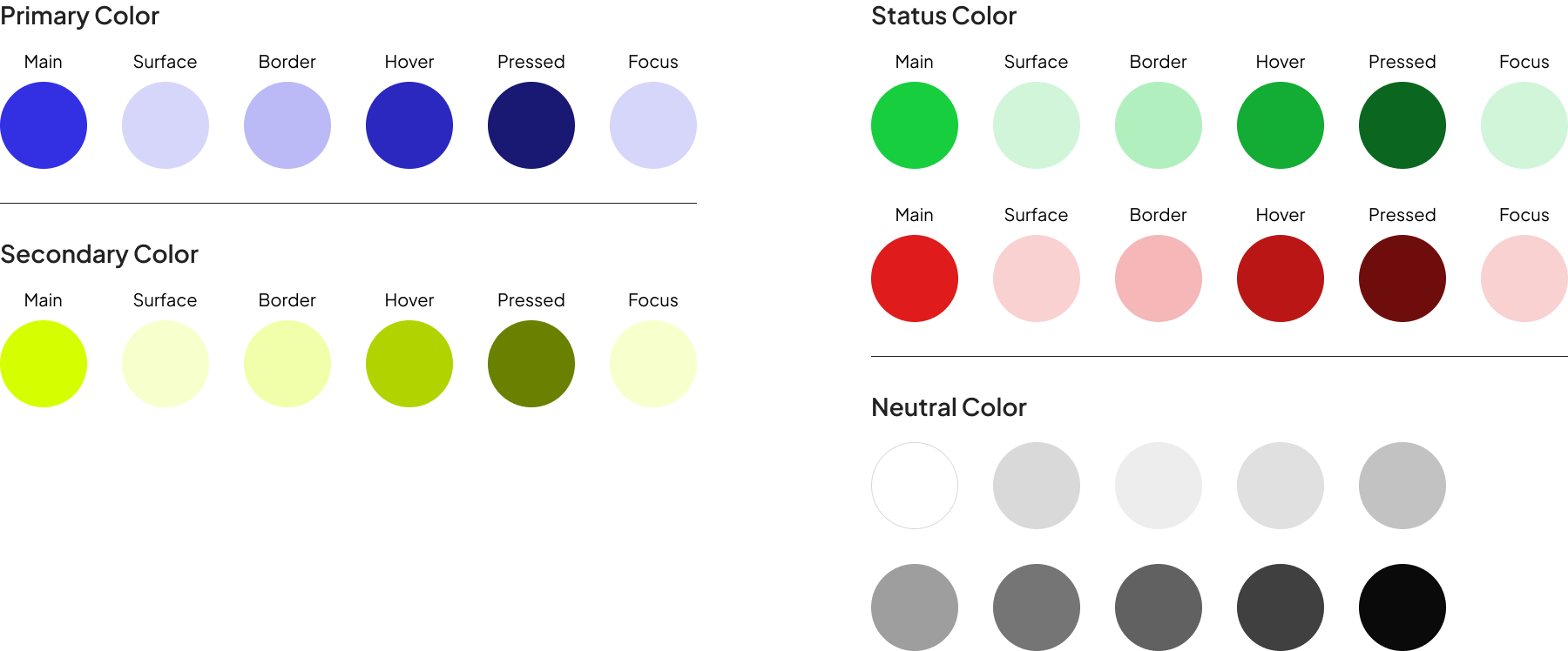
I use the format 70 - 20 -10, which means for the primary/main color, I use 70%, then the secondary 20%, and the accent color 10%. I use this format with a color format that is often applied.
Hi-Fidelity Design
After researching and understanding the user's needs, I created a high-fidelity design that applies the selected color and font combination.
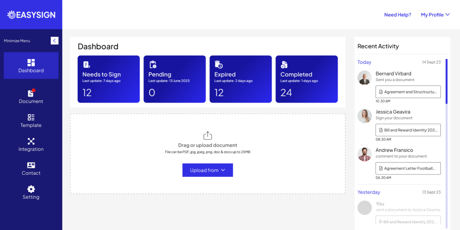
Dashboard
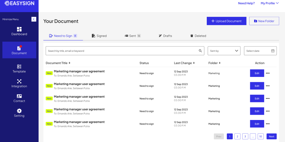
This page allows users to monitor documents or activities related to their account. In this section, the user can also see the document's status and upload documents quickly.
Document List
Users can see a list of documents uploaded or sent from other users on this page. Users can also edit or provide reminder emails to other users.
Integration
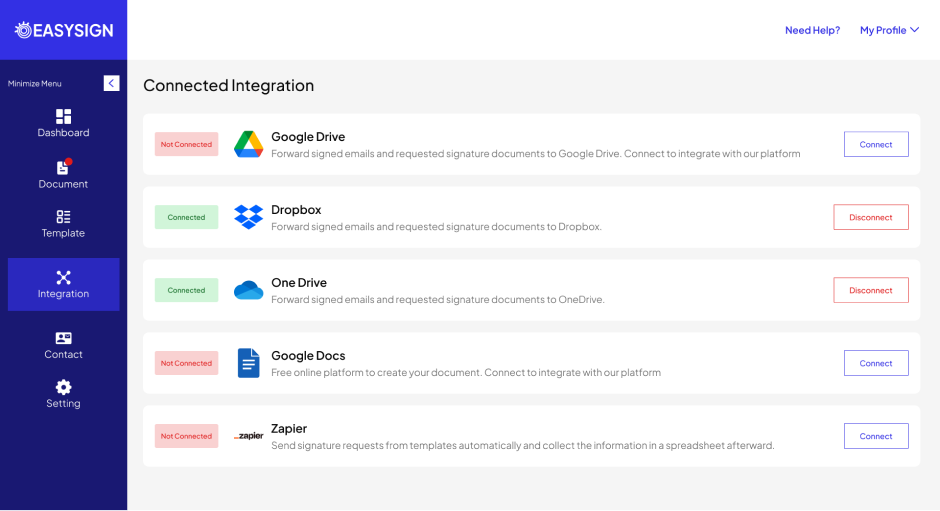
Connect various types of cloud storage on this page to make it easier for users to upload and save documents.
Template List
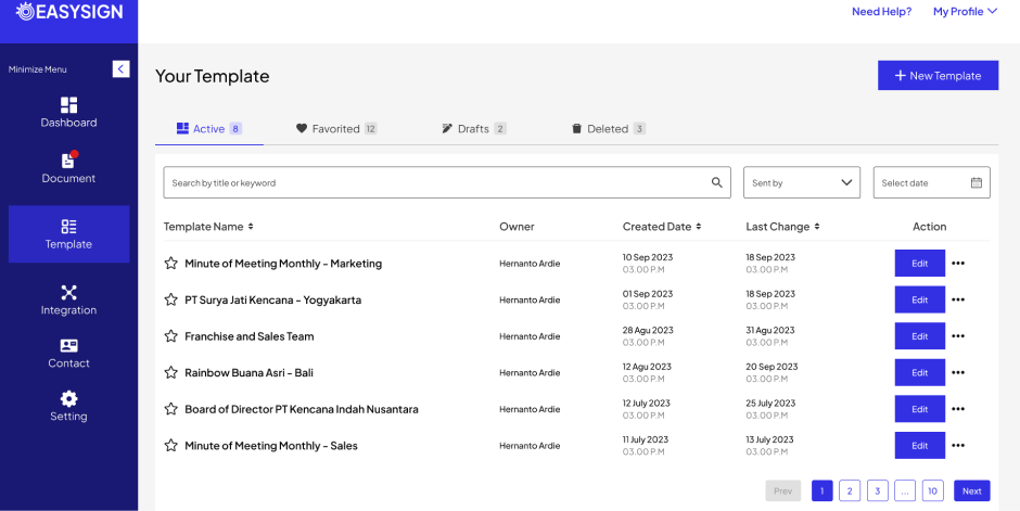
Send documents more quickly and easily. With this page, users can see a list of templates that have been created and can use those templates repeatedly.
Contact List
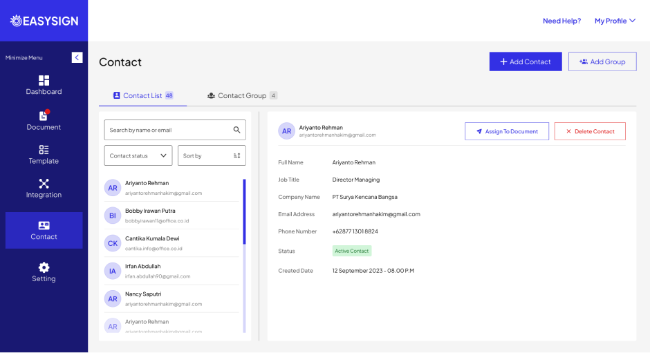
Users do not need to enter their email and username manually; the feature on this page stores a list of essential contacts for users can send documents to
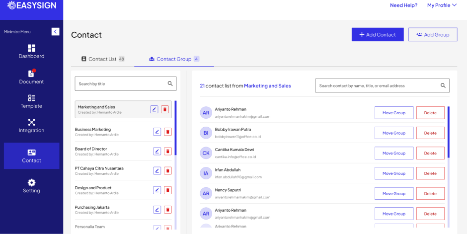
Contact Group
This page contains groups from the contact list entered on the website.
Users can easily send documents to multiple recipients.
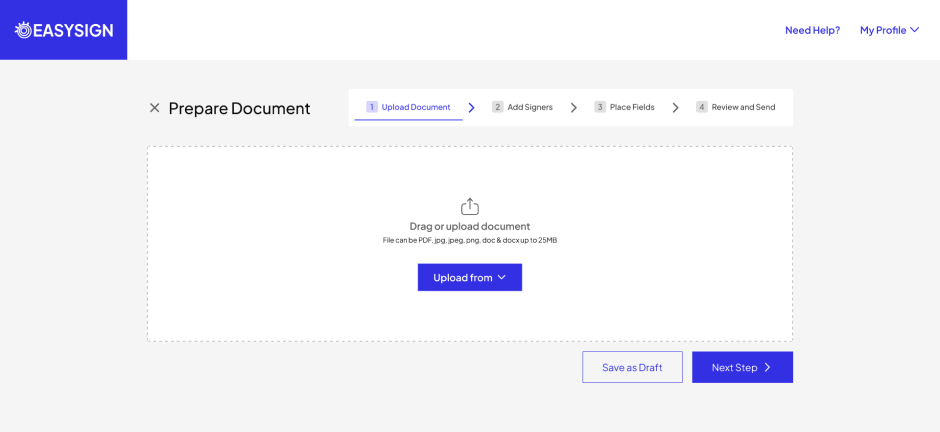
Upload Document
Users can upload various types of document formats. Apart from that, users can also upload from cloud storage to make it easier and more practical.
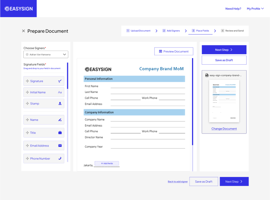
Custom and Tags Field
This feature lets users put custom fields and tags on their document pages. The types and types of custom fields and tags also vary.
User Testing
User Testing Summary
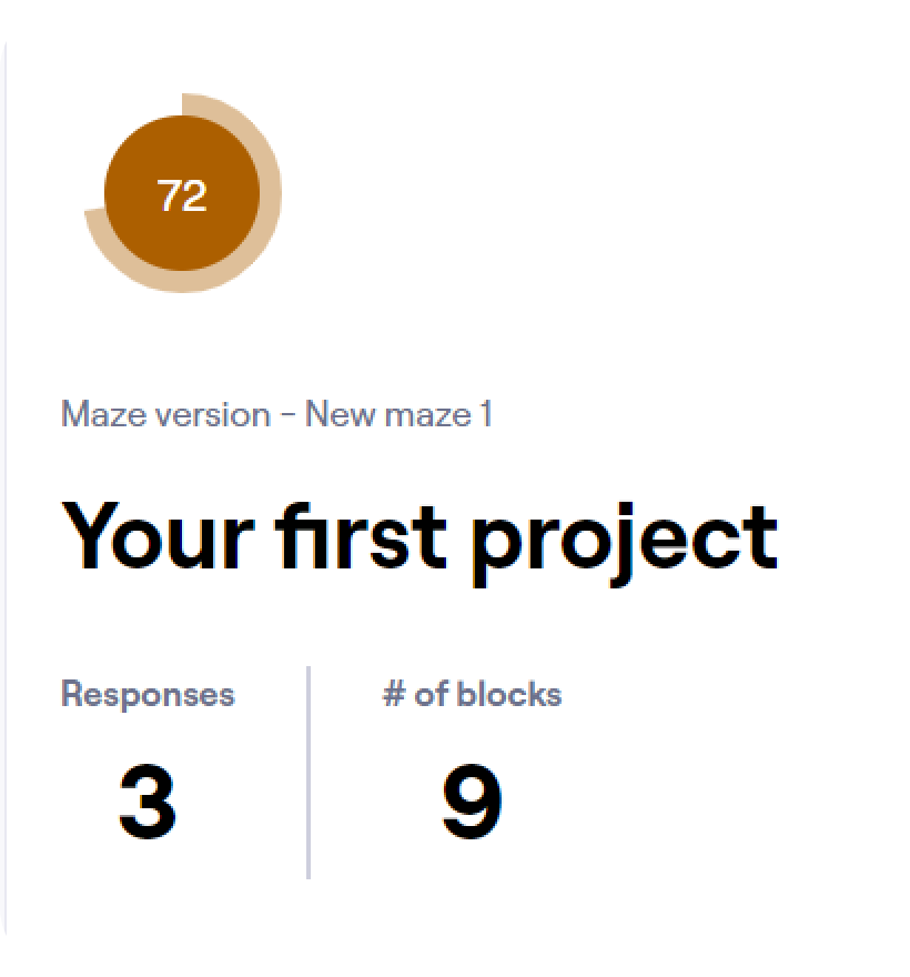
The following are the results of user testing on three users with experience using software-as-a-service websites.
In user testing, I used eight tasks that were tested on users. This task covers all the user flows that I planned for this product.
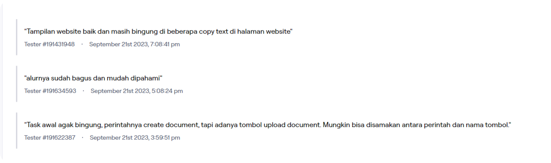
User Insights
From all the users I have tested, I also get feedback regarding the display I tested on them.
Takeaways and Lesson Learned
Color & Layout
The choice of color and layout is crucial for users because users want to use the application for a long time, so the design and colors are comfortable and make the user happy.
UX Copy
When pressing a button or selecting a page, the choice of sentences in the UX copy will be apparent to the user.
Simplicity and Efficiency
The flow of using website products becomes more efficient and less lengthy so that users don't feel confused when trying to send, receive, or sign